by Dora Sapunar, M.A. Design Studies/Parsons ’15
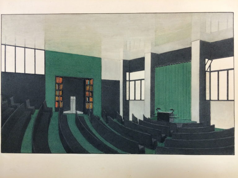
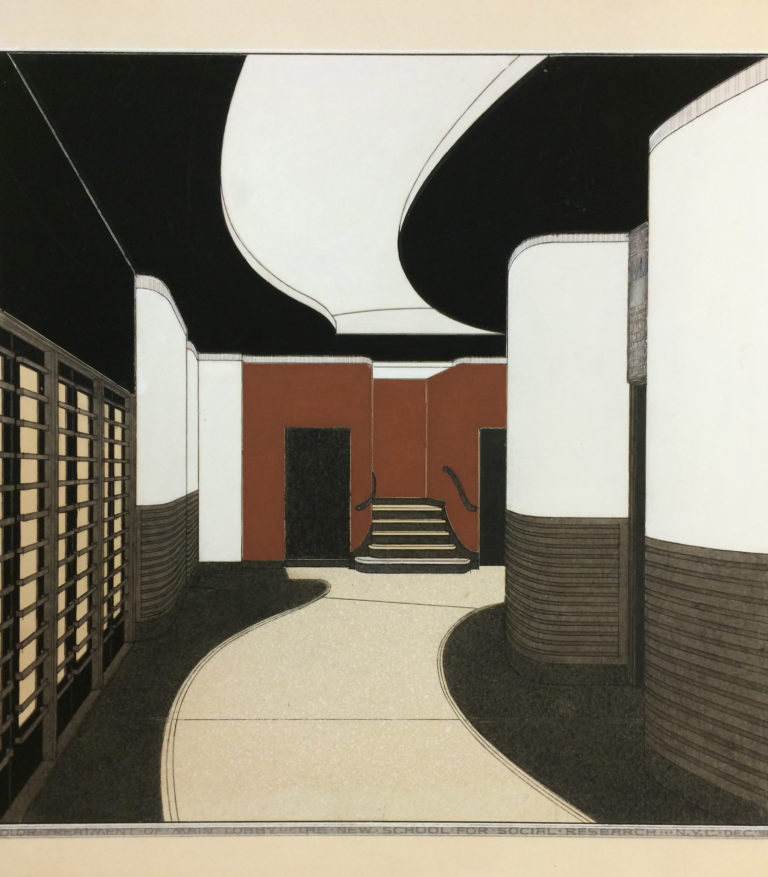
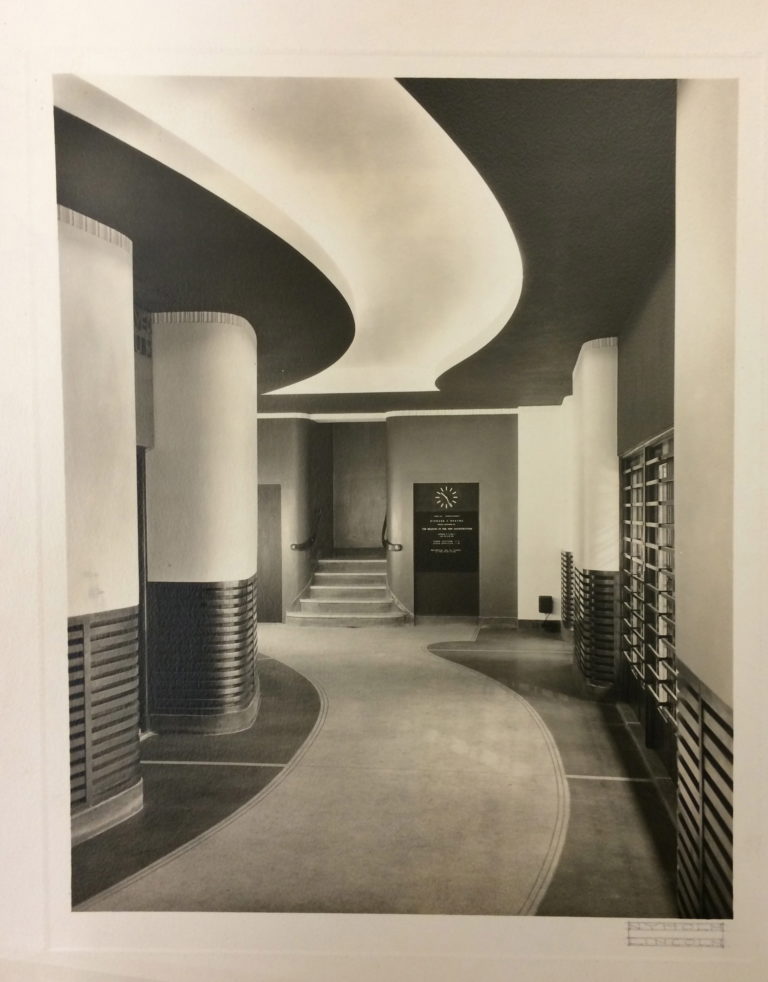
Although it is hard to tell from the contemporary perspective, for a long time the austere gray geometric lines of the facade of 66 West 12th Street hid behind them a much more eclectic masterpiece. In the interiors of the New School 1930 building, a late work of architect Joseph Urban, we could see a manifestation of a lifetime of experiences and a breadth of influences. In these interiors, Urban employed the sinuous curves of the Secession movement which originated in his home country, Austria-Hungary. He also drew from art-deco, a geometric but decorative style which was appropriated by the film-industry, in which Urban worked. The interior also revealed Urban’s understanding of new developments in architecture and an admiration of the works of functionalist architects. And, finally, what was most distinctly evident in the New School interiors, was Urban’s deep-seated appreciation of color. Working as a set designer in theater taught him how color could be used to express emotion, while working on film sets taught him how to use contrast to achieve the strongest effect, all of which he applied in the designing the color scheme for the New School.


In his designs for the school, Urban utilized a different color scheme for each of the seven floors and the basement, drawing mostly from bold and energetic colors which gave a strong sense of character to each space. The colors were articulated differently in each room, and served distinctive purposes. They were primarily governed by principles of lighting. Cool colors were used in shadow and warm colors in light, but Urban also used color to create focal points in spaces and to make the plan as legible as possible. Interior window frames generally carried the color of the rooms, conveying a sense of the interior to curious passersby. So the mezzanine was introduced by the color orange, the second floor was a gray blue, the third orange and gray, fourth a dark blue, and fifth yellow. The sixth floor, the home of the donor of the property, was a muted white.


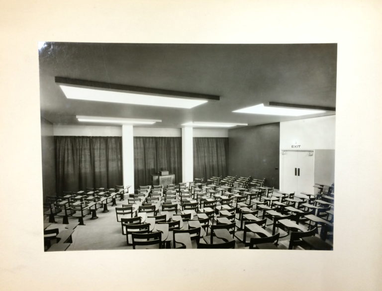
In the interior, colors were used primarily on the planes of the building, while structural elements, such as columns, were generally kept white, adding to the sense of spaces as theatrical sets, serving as backdrops for the everyday activities of the students. The New School interiors remain a work of great boldness, their strong colors generating a dramatic effect, unfortunately only preserved in sumptuous renderings and color schemes archived in the Columbia University Rare Book and Manuscript Library.
A wealth of information about the project to develop, design, build, and renovate 66 West 12th Street will be found in New School Architectural plans and drawings for 66 West Twelfth Street records and New School Publicity Office records.
For more photos, see here. For press clippings, see here. For architectural plans, see here.