Editor’s note: the publication date of this article reflects the date this article was added to the new version of The New School Histories website, not the original publication date. Please contact archivist@newschool.edu with any questions.
Last week we saw the unveiling of a new “visual identity” here at the New School including a new custom created typeface called Neue and a new logo.
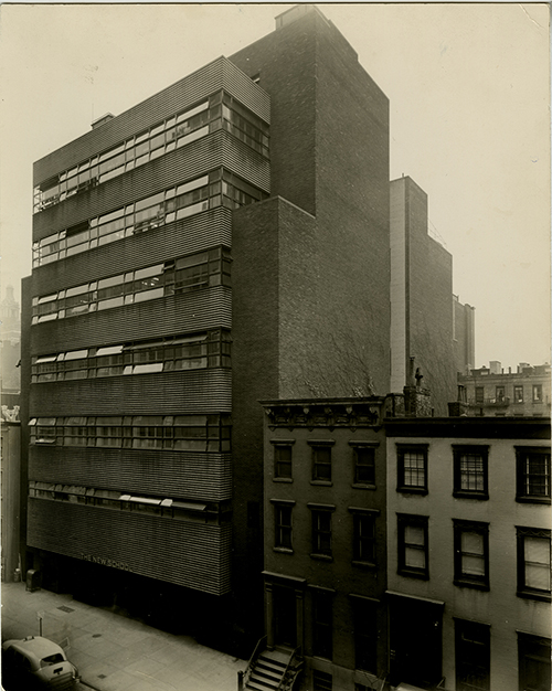
The logo is said to be inspired in part by the iconic Joseph Urban-designed building located at 66 W 12th Street, which opened in 1931.
Since I’ve had the pleasure of working on a project to digitize historical New School course catalogs and bulletins over the past several years, this campaign brought to mind the many changes in visual identity that the New School has undergone since it’s founding in 1919. Again and again, the school has revamped the design elements used in its bulletins and other publications, and I thought it might be interesting to take a look at some of these. Was the purpose of these makeovers been to express its commitment to the contemporary and progressive? My goal is just to highlight some of the typefaces and logos used by the New School, and I’ll leave the interpretation to you! Feel free to share what you think of these past looks in the comments.
For the first decade of its existence, the New School for Social Research published announcements that were relatively understated and remarkably consistent.
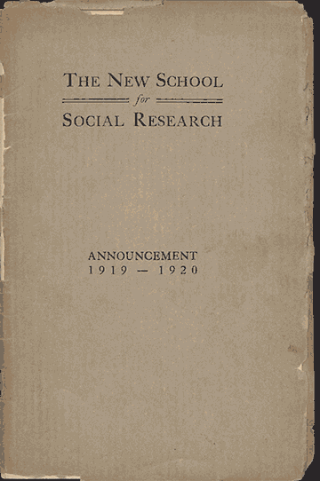
Interestingly, the heading used at that time had more than a little in common with the new logo, as both are characterized by two bold horizontal lines.
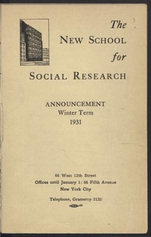
Although the building at 66 West 12th Street had not yet been built at the time these announcements were issued, it shares the emphasis on horizontal lines. From the time the building opened in 1931, it began perennially appearing in New School promotional materials in various forms. The first announcement issued at the time of the opening featured a logo consisting of a direct illustration.
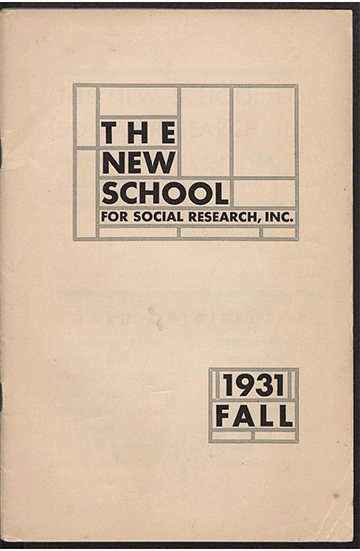
From 1931 to 1937 the school used a striking pattern for the semesterly course announcements, one that emphasized The NEW SCHOOL over “FOR SOCIAL RESEARCH,” perhaps an early indication of name changes to come. Again the emphasis is on straight lines at right angles, somewhat reminiscent of a Mondrian painting.
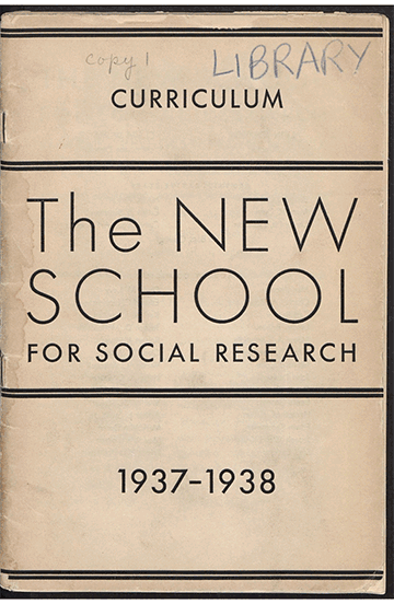
In 1937 the catalog was redone with a simpler design. The cover prominently featured a typeface that appears to be Futura Light, meant to invoke a forward-facing, futuristic feel. “THE NEW SCHOOL” takes even greater prominence with “FOR SOCIAL RESEARCH” receding farther.
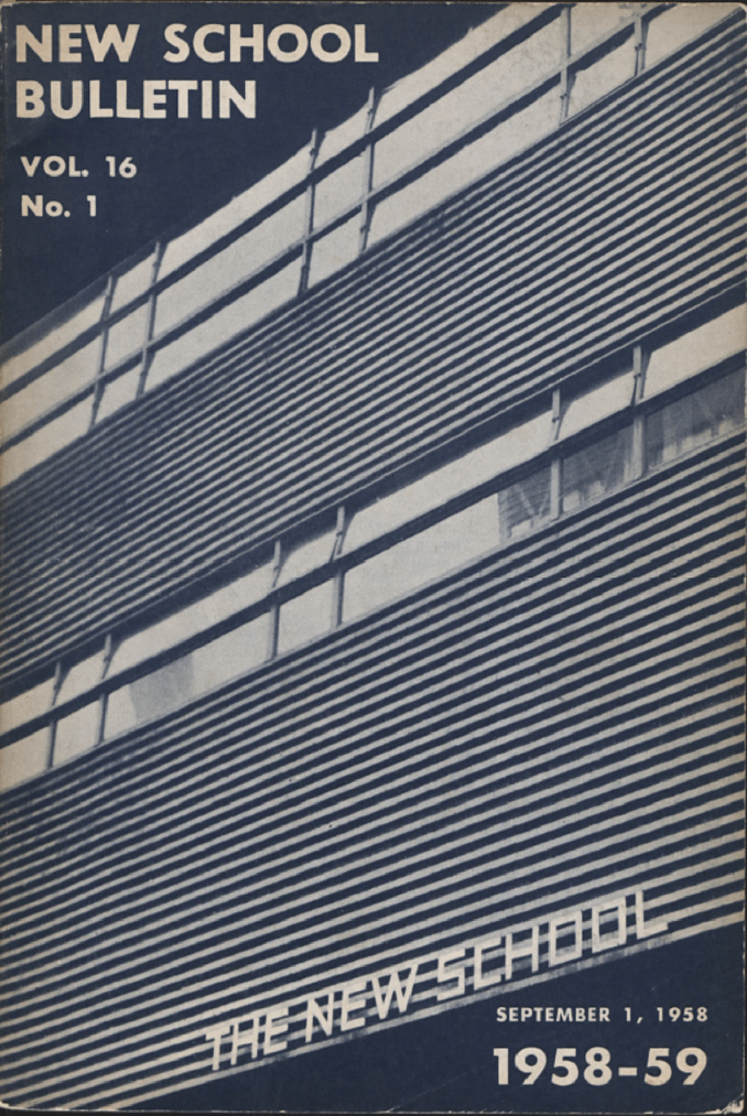
After a couple of years of very plain catalog covers at the end of World War II, The New School began it’s longest-running cover design. Based on a somewhat abstract-appearing close up of a photograph of the Joseph Urban building, the cover debuted around the same time the school significantly expanded and began offering undergraduate credit for the first time. Here “FOR SOCIAL RESEARCH” is dropped entirely with the name listed only as “NEW SCHOOL,” although for many years after the official full name continued to be the New School for Social Research. Printed in slightly varying shades of navy blue, black and forest green, the cover design was used for fourteen years, from 1945 to 1959.
http://digitalarchives.library.newschool.edu/index.php/Browse/objects/key/fc3e061dabf44fccb63ee9be498a2463/facet/decade_facet/id/1950s/view/images
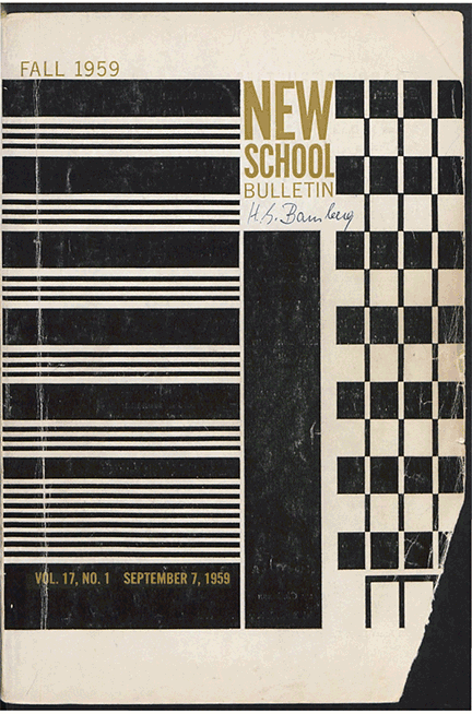
A change in the cover design was made in 1959, when the school celebrated its fortieth anniversary and the opening of a new building on 11th Street. The design presents a highly stylized image of the same building, and also includes the next door J.M. Kaplan hall. It features a new typeface as well. These were used only between 1959 and 1961, after which the school produced catalogs with original covers each year.
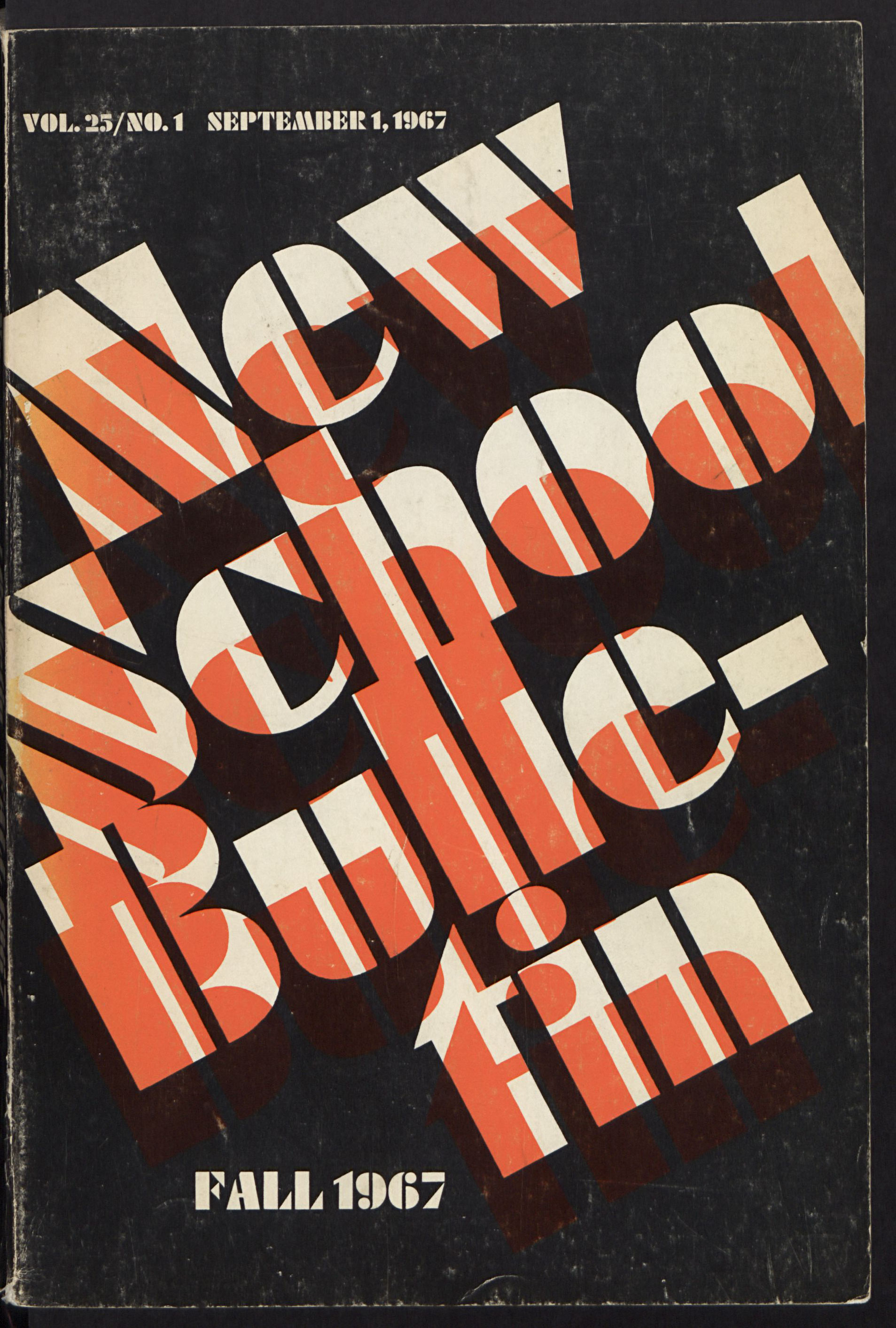
After 1959, the school began to issue catalogs with unique covers each semester, often commissioned by well-known artists. Perhaps as a gesture towards unity, the school began to use a tree logo in 1966 that would typically be printed on the title page of each catalog.
During this period there was significant variety in the catalog covers, and in the typefaces used
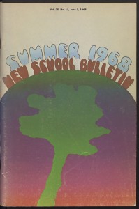
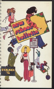
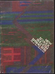
The tree logo continued to appear in catalogs for twenty years, until 1986, after which it continued to be used in a number of forms, including on flags outside of New School buildings, and on t-shirts and other merchandise.
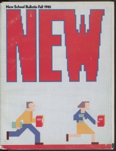
A new logo began to be used in 1993 featuring a triangle made of six squares, perhaps meant to refer to the different divisions of the school. This logo appeared on all catalog covers until 2005, with the same typeface and variations only in color.
In 2005, The New School hired branding consultancy Siegal+Gale for a redesign intending to unify the school’s separate division under one brand. The result was a series of changes including new names for the various divisions of the school, and a new spray paint style logo.

The 2005 branding was somewhat controversial and came at a time of drastic changes and many heated debates about the leadership and future of the school. In contrast, the current rebranding seems to reflect a desire to recuperate something of the school’s history and legacy. It’s hard to predict what kind of logos or typefaces the school will be using in 10 or even 5 years, as here at the New School, the main constant is change!