by Aaron Winslow
They say that history is made in the margins. Or maybe they don’t say that, exactly, but it’s probably true, and one of the joys of working as a processing archivist is having the chance to explore (and to help others explore) these marginal histories. And while it’s always great to turn up something hidden in the collection of someone well-known, even better is when the papers of an unknown artist, someone ‘in the margins,’ if you will, actually turns out to be central to that particular history.
The Jeremiah B. Lighter graphic design work papers perfectly illustrate the importance of digging into the margins of the archives. Although Lighter isn’t a household name, his papers provides a glimpse into a period of major change in American book design, a moment that his work—along with countless other more or less anonymous artists and designers—helped to define.
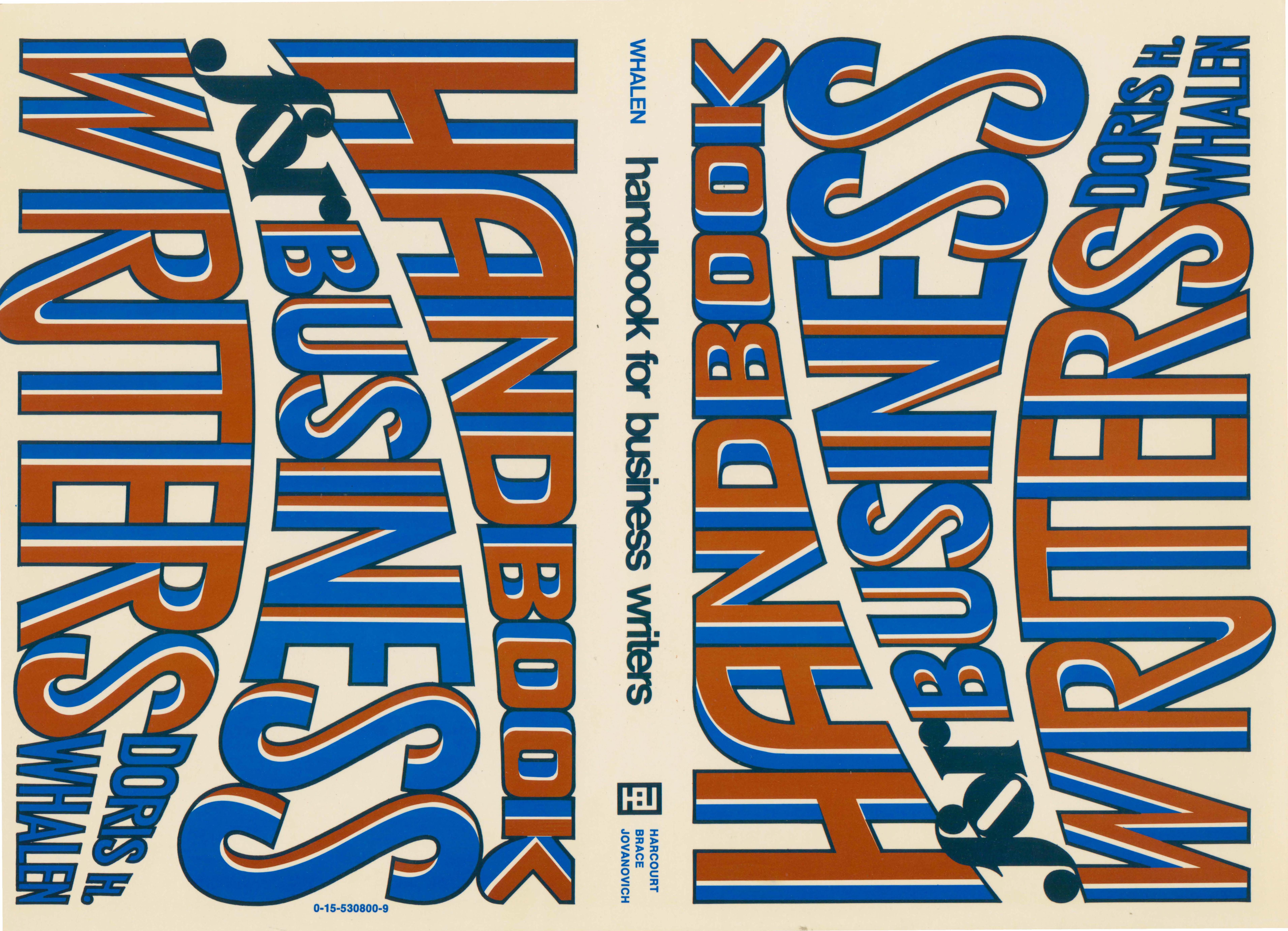
Trained as an artist, Lighter worked as a freelance designer for over fifty years, from 1945 to the early 2000s, producing a body of work that includes typography, advertisements, book design (for both commercial and scholastic presses), and original artworks. Although he worked proficiently in a wide variety of mediums—including acrylics, pen and ink, and watercolors—Lighter had a special talent and inclination for woodcut prints, which he deployed across the spectrum of his design work, particularly in his book design. Lighter began working as a book designer when the field was in a period of major transformation. During the first half of the 20 century, lurid and poorly produced pulp styles had come to dominate American book jacket design. Against this tendency, the Book Jacket Designers Guild, led by German-émigré artist and designer George Salter, released a manifesto rejecting the cheap production methods of pulp publishing and advocating, instead, for higher artistic standards. While Lighter’s jacket design style diverges sharply from Salter’s, he brought a similar sense of artistic rigor, craft, and quality to the medium, and his hand-made woodcut prints and sculptures lend his jackets a unique aesthetic. Though often figurative, they veer heavily toward the abstract and expressionistic, displaying a late modernism that suggests the influence of Sixties Pop and kitsch. Lighter carried this sensibility into his textbook design—primarily for Harcourt Brace Jovanovich—in the Seventies.
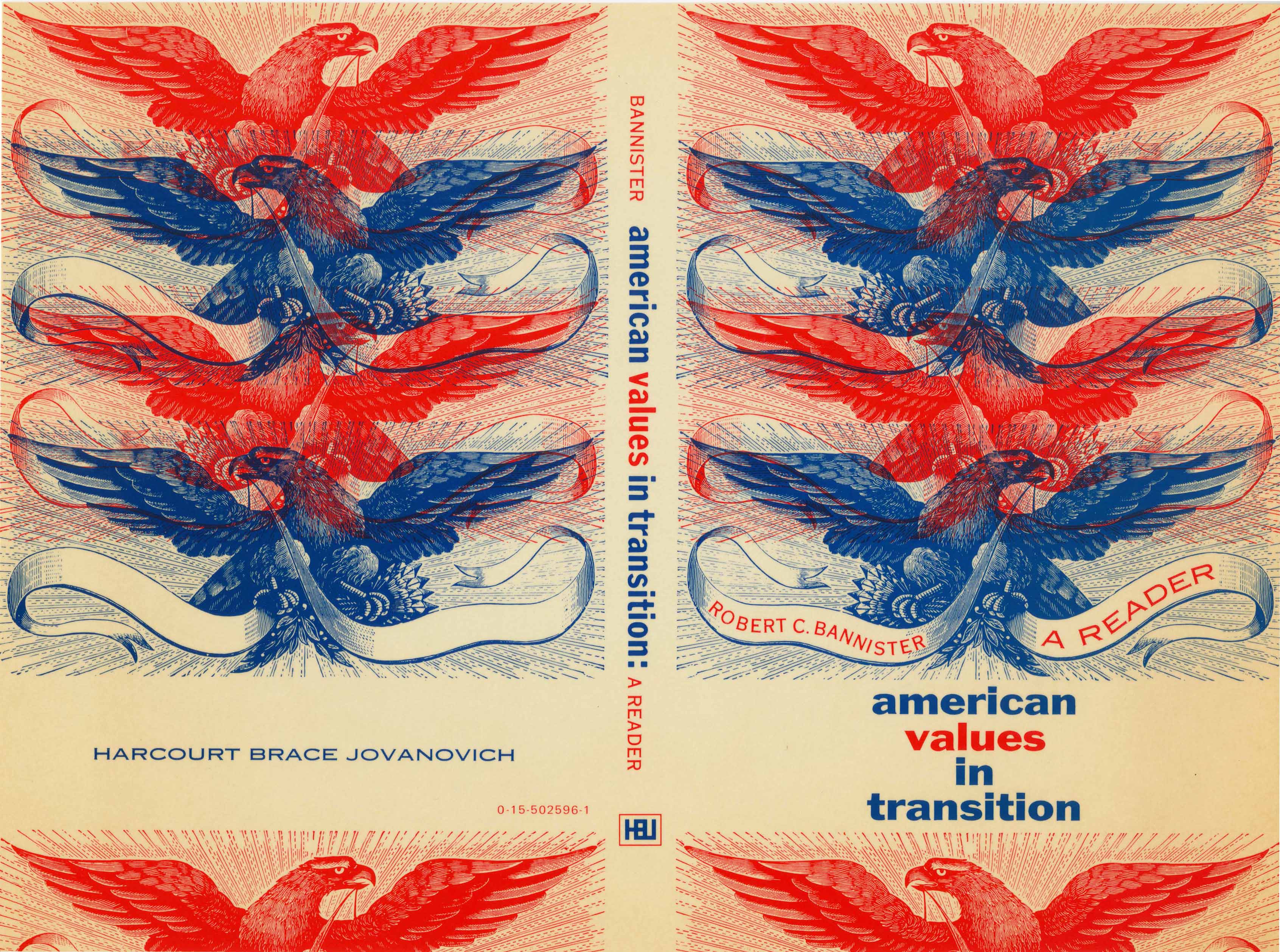
Along with contemporaries such as Tom Suzuki, Lighter contributed to a paradigm-shift in American textbook design. A medium in which design had previously been almost an afterthought—with most covers done in black and white and using photos and sketches provided by the authors—was transformed into one in which lush design was given new prominence. Lighter’s designs, often meticulously composed using woodblock prints and sculptures (see, for example, Styles for Writing) exemplify this new approach. Lighter’s career—and, to give the requisite plug here, his archive—not only reveals a single artist’s body of work but also illuminates a major, and vastly under-appreciated, period in American art history, when artists schooled in the ideas and techniques of modernism entered publishing and book design (as part of the huge spike in post-war book production). These artists and designers pushed once avant-garde styles and innovations into the mainstream via mass-market books such as golf-tip guides, cookbooks, and writing and rhetoric manuals. In other words, they brought what was once marginal into the very center of American culture.